Advanced Reporting report designer
NAVIGATION
Modules > Advanced Reporting > Create icon  > Create Report > select report type > Create
PERMISSIONS Advanced Reporting > View Reporting and run reports
VSA 10 provides an intuitive report designer with an easy-to-use interface, letting users design highly engaging and interactive reports without prior reporting experience. The report designer enables you to create a new report or edit an existing one without writing any code. The designed reports can then be exported to any format or printed from the preview window.
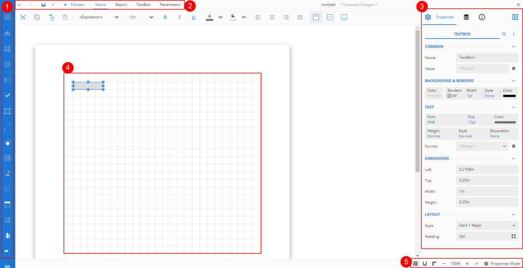
The features that comprise the report designer are labeled as follows:
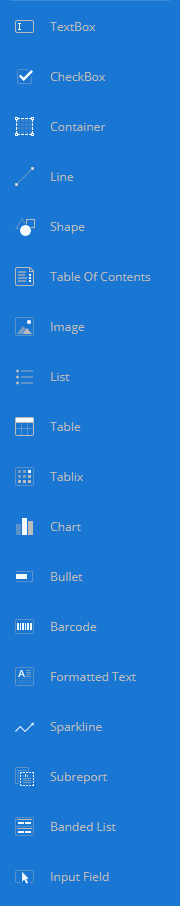
 Toolbox
The toolbox contains the controls that assist in designing reports. Use the menu icon  to expand or collapse the report toolbox in the designer.
Explorer pane
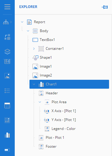
The Explorer pane provides an overview of the hierarchy of added report items. It displays the current selection and allows the selection of other report items.
Group Editor pane
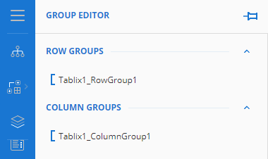
The Group Editor pane shows column and row hierarchies of tablix members for the currently selected tablix or table data region. Refer to Tablix report element.
Layers pane
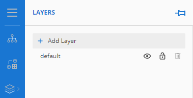
In the Layers pane, you can view and add layers to the report. Click Add Layer to add new layers. The initial layer in a new report is named default.
Elements
For details on what elements are available in the toolbox to design a report, refer to Advanced Reporting report elements.
Menu bar
The top ribbon contains options to undo or redo an action, to save or preview a report, and to format and design options available in the various tabs.
Always located in the top left of the menu bar, regardless of which tab is selected, are the following options: 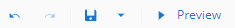
Undo: Undo the last action in the designer.
Redo: Redo the last action that was undone in the designer.
Save: Save the current report.
Preview: Preview the current report.
Selecting other tabs opens additional configuration options.
Home

The Home tab consists of commonly used report editing and text formatting operations, such as cut, copy, paste, font, font size, font color, and horizontal and vertical text alignments. These operations are specific to the selected report element.
Report

The Report tab contains options to add, delete, or move pages (page report), add or remove the header or footer (RDL report), and change report themes.
Control options (context sensitive)

The Selection Options tab name changes based on the selected report control and contains configuration options specific to that control.
Parameters

The Parameters tab contains the design area for designing a custom parameter panel. The configuration options in the panel include default properties set, like name, label, default value, and so forth.
Properties and data panels
In this pane, you can access and modify the properties of a report or manage data connection.
Properties
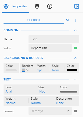
The Properties tab displays the properties of the selected report element in the design area.
Using the menu at the top, you can collapse and expand the collections on the property panel. You can also toggle the visibility of advanced properties.
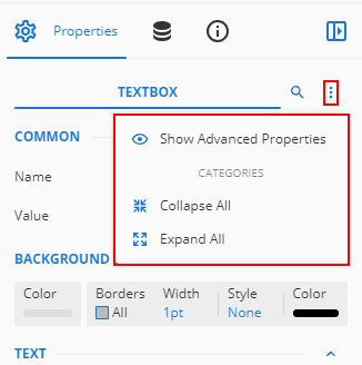
NOTE The panel displays any shared properties when more than one control is selected.
Data
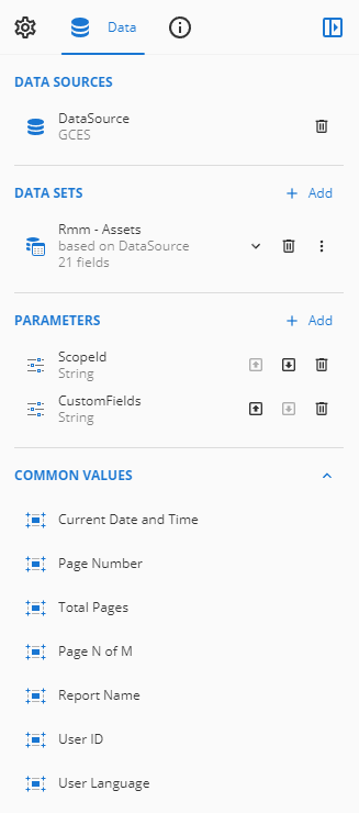
The Data tab contains options to add data sets, parameters, and common values:
- Data Sets: Displays the data sets available for report design.
- Parameters: Allows you to add and modify report parameters.
- Common Values: Displays common values to use in your reports, such as Current Date and Time, Page Number, Total Pages, Page N of M, Report Name, User ID, and User Language.
Info
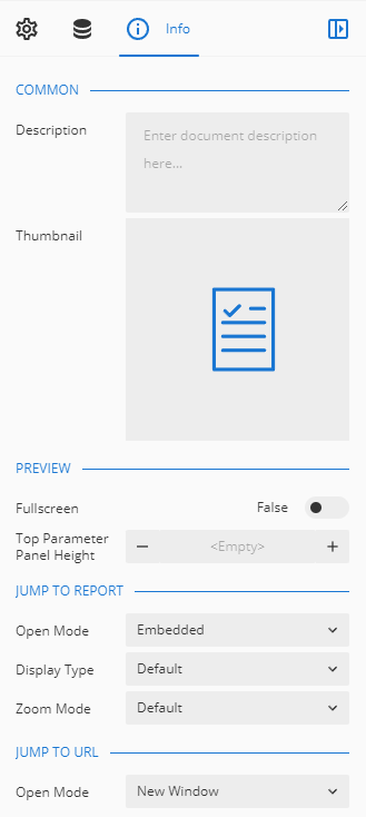
The Info tab contains options to modify the information of the report, contained within the following sections:
- Common: Add common settings, like descriptions, thumbnails, and permissions to the report.
- Preview: Modify the view mode, full-screen mode, and top parameter panel height.
- Jump to Report: Modify the jump-to settings, including open mode, display type, and zoom mode.
- Jump to URL: Modify the jump-to-URL open mode.
- Internationalization: Add language resource files to the report.
- Export: Add a filename template to use when exporting the report.
For more details, refer to Advanced Reporting: Info pane.
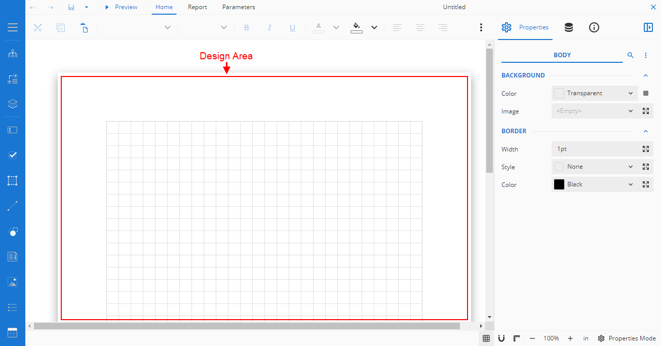
Design area
This canvas is the main body of the report, where you will add elements from the toolbox to build your reports.
Other settings
The other settings in the lower-right corner of the report designer allow you to set zoom percentage, switch between advanced or basic property mode, and more.
 Grid: Show or hide grid lines in the design area.
 Snap: Enable or disable report controls to snap to grids and guides when you drag them into the design area. You can also specify the size of the grid lines.
 Ruler: Show or hide rulers in the design area.
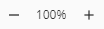 Zoom: Set the zoom percentage of the design area by clicking the zoom-in and zoom-out icons.
Grid Unit: Switch the measurement unit for the grid lines to inches (in) or centimeters (cm). By default, the grid unit is set to inches.


