Tablix report element
NAVIGATION
Modules > Advanced Reporting > Create icon  > Create Report > select report type > Create > Tablix
NAVIGATION
Modules > Advanced Reporting > Categories icon  > click a row > Edit > Tablix
PERMISSIONS Advanced Reporting > View Reporting and run reports
The Tablix data region displays the data in a cross-table format, which is especially useful in analyzing a large set of categorical data. It also provides an efficient way to create a multidimensional report organized in meaningful hierarchies based on the business requirements.
A tablix is a combination of two report regions, a table and a matrix. Therefore, it combines the functionalities of both the data regions (table and matrix) with added capabilities including the support for adjacent groups, interactive layout options such as the stepped row group, collapsed group, and more. By default, a tablix consists of four cells, where each cell contains a TextBox element.
 Tablix components
Typically, a tablix is composed of the following components:
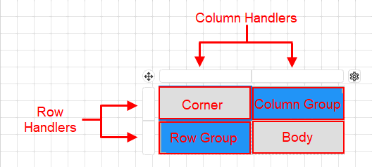
- Corner: Displays static information such as headings, titles, etc. representing the tablix data.
- Row Group: Groups in this area organize the report data in horizontal direction. A row group is represented by a square bracket on the left side of the row.
- Column Group: Groups in this area organize the report data in vertical direction. A column group is represented by a square bracket above the column.
- Body: Displays aggregated data by the row and column grouped data in the tablix data region.
Static and dynamic rows and columns
A row and column in a tablix data region can either be static or dynamic.
- Static Rows and Columns: Static rows and columns are used to display labels and totals. They are rendered only once when you preview a report. For example, the header and footer rows in a tablix are static rows.
- Dynamic Rows and Columns: Dynamic rows and columns are associated with one or more groups. They are rendered once for every unique value in the group when you preview a report and are known as group instances.
Tablix Wizard
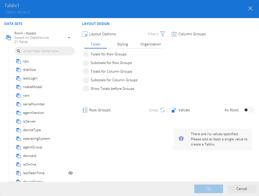
The Tablix Wizard is broadly divided into two portions. The portion on the left displays the available fields in the bound dataset. The portion on the right displays the design area that allows you to configure the row groups, column groups, values, and layout options.
If a dataset is already added to the report, the Tablix Wizard will automatically launch when you drag and drop a new tablix onto the report.
The Configure option in the upper-right corner of the tablix also displays the Tablix Wizard.
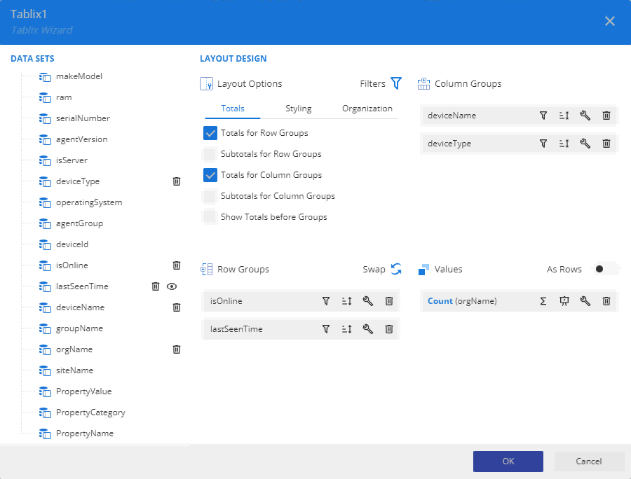
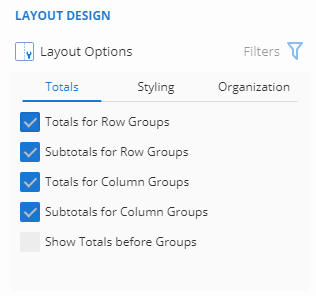
- Layout Design: It provides various layout options for the row and column groups in a tablix. You can also use the Filter button to filter the data in a tablix.
- The Totals tab describes the layout settings related to the totals and subtotals for the row and column groups.
- Totals for Row Groups: A new row is added to display the aggregated values at the end or beginning of the parent row group.
- Subtotals for Row Groups: A new row is added to display the aggregated values at the end or beginning of the child row group. This option is applicable when a tablix consists of a row group hierarchy.
- Totals for Column Groups: A new column is added to display the aggregated values at the end or beginning of the parent column group.
- Subtotals for Column Groups: A new column is added to display the aggregated values at the end or beginning of the child column group. This option is only applicable when a tablix contains a column group hierarchy.
- Show Totals before Groups: Choose whether to display the totals and subtotals before or after row and column groups.
- The Styling tab lists the available styles that you can apply to the tablix, such as Light Style 1 Accent 1 Tablix, Light Style 1 Accent 2 Tablix, Light Style 1 Accent 3 Tablix, No Style No Grid Tablix, SmoothTablix, and more. The styling options depend on the current report theme.
- The Organization tab provides interactive layout options for tablix.
- Expand/Collapse Groups: Expands and collapses the rows and columns in a group hierarchy.
- Collapsed Group: Hides the rows and columns associated with child row and column groups. This option is available when you check the Expand/Collapse Groups option.
- User Sort: Adds interactive sort buttons to the column headers that help to organize the tablix data.
- Stepped Rows Groups: Displays all the child row groups in the same column as the parent group. By default, the row groups in tablix are displayed in different columns.
- Frozen Rows and Columns: Locks certain rows and columns to keep them visible while the rest of the tablix scrolls.
- The Totals tab describes the layout settings related to the totals and subtotals for the row and column groups.
- Row Groups: Arranges the data in groups by rows. The row groups expand vertically in a report. You can apply filter on the row group, specify the sorting order for the row group, modify the data format, and swap the rows/column groups.
- Column Groups: Arranges the data in groups by columns. The column groups expand horizontally in a report. You can apply filter on the column group, specify the sorting order for the row group and modify the data format.
- Values: Refers to the summary values to be displayed in the tablix cells. You can specify the aggregate function for the field, modify the data format, or apply summary and total value calculations (such as % grand total, % row group total, and so forth). For more information on summary and total value calculations, refer to
Advanced Reporting: Expression Editor.
By default, the summary values are arranged horizontally. You can use the Show Values as Rows/Columns to arrange the data vertically.
The Tablix Wizard displays a warning message if the structure of the tablix gets complicated due to the modifications in the tablix structure.
Binding data to a tablix data region
- From the report toolbox on the left, drag and drop the Tablix
 data region into the design area (or simply click the report item).
 - If a dataset is already added to the report, a Tablix Wizard appears after dropping (or clicking) the data region. The Tablix Wizard allows you to quickly configure the tablix data and layout.
Drag and drop the dataset fields from the left panel into the Row Groups, Column Groups, and Values areas on the right. A tablix with defined row and column groups is created as shown.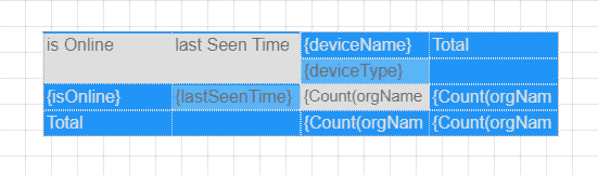
For more information, refer to Tablix Wizard.
If you close the Tablix Wizard, a blank matrix with two rows and columns is created. You can use the context menu to manually add the row and column groups and the Group Editor to view the row and column group hierarchies.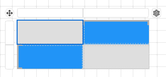
Adding row and column groups
The tablix data region organizes the data in groups by rows and columns. The row group expands vertically and the column group expands horizontally in the report.
The rows and columns inside the groups repeat once for each unique group value. The rows and columns outside the groups repeat once for the group.
You can create nested groups as well as adjacent groups in a tablix.
The easiest way to add a group in a tablix is through the Tablix Wizard. However, you can use the cell context menu or the Group Editor to insert row and column groups.
Using the Tablix Wizard
The Tablix Wizard is the primary way to add row and column groups in a tablix. The wizard appears automatically when you drop the tablix data region onto the design area or click the data region in the report toolbox. You can also use the Configure option to open the Tablix Wizard. For more information, refer to Tablix Wizard.
The left pane in the wizard displays the available fields in the bound dataset.
- To create a row group, drag and drop the dataset field to the Row Groups area. You can create a group hierarchy by placing multiple fields in this area organized in a specific order.
- To create a column group, drag and drop the dataset field to the Column Groups area. You can create a group hierarchy by placing multiple fields in this area organized in a specific order.
The corresponding buttons next to the fields placed in the Row Groups and Column Groups areas allow you to specify the sorting order and change the data format for the field. Use the Swap button in the Row Groups area to swap the rows and column groups.
Using the cell context menu
The cell context menu in a tablix provides options to create both nested and adjacent groups. You can access these options by right-clicking the cell in the tablix data region.
- Row Group: To insert a row group in a tablix, choose from the following options.
- Parent: Inserts a parent row group.
- Child: Inserts a child row group. This option is unavailable if there is no parent row group.
- Adjacent Before: Inserts an adjacent row group above the selected cell.
- Adjacent After: Inserts an adjacent row group below the selected cell.
- Delete: Deletes the row group.
- Enable Group: Inserts a parent/child row group based on the cell location. This option is available when no groups are associated with the selected cell.
- Disable Group: Deletes the parent/child row group based on the cell location. This option is available when one or more groups are associated with the selected cell.
- Column Group: To insert a column group in a tablix, choose from the following options.
- Parent: Inserts a parent column group.
- Child: Inserts a child column group. This option is unavailable if there is no parent column group.
- Adjacent Left: Inserts an adjacent column group to the left of the selected cell.
- Adjacent Right: Inserts an adjacent column group to the right of the selected cell.
- Delete: Deletes the column group.
- Enable Group: Inserts a parent/child column group based on the cell location. This option is available when no groups are associated with the selected cell.
- Disable Group: Deletes the parent/child column group based on the cell location. This option is available when one or more groups are associated with the selected cell.
Using the Group Editor
The Group Editor in the report toolbox shows the row and column hierarchies for the currently selected tablix data region. It also provides you options to add nested and adjacent groups to the chosen group in the editor.
- To add a row group to the currently selected row group, click the vertical ellipses icon and choose from the following options.
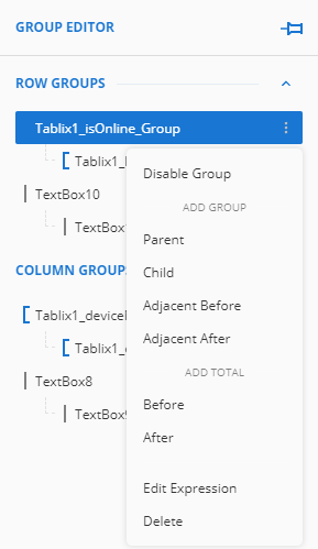
- Parent: Inserts a parent row group.
- Child: Inserts a child row group.
- Adjacent Before: Inserts an adjacent row group above the selected row group.
- Adjacent After: Inserts an adjacent row group below the selected row group.
- Enable Group: Inserts a parent/child row group based on the text box location. This option is available when no groups are associated with the selected text box.
- Disable Group: Deletes the parent/child row group based on the text box location. This option is available when one or more group is associated with the text box cell.
- To add a column group to the currently selected column group, click the vertical ellipsis icon and choose from the following options.
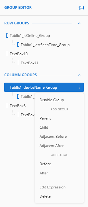
- Parent: Inserts a parent column group.
- Child: Inserts a child column group.
- Adjacent Left: Inserts an adjacent column group to the left of the selected column group.
- Adjacent Right: Inserts an adjacent column group to the right of the selected column group.
- Enable Group: Inserts a parent/child column group based on the text box location. This option is available when no groups are associated with the selected text box.
- Disable Group: Deletes the parent/child column group based on the text box location. This option is available when one or more group is associated with the selected text box.
In the Tablix Group Editor, when a column is selected within a column hierarchy that is the column group, or a row is selected within a row hierarchy that is the row group, it highlights the specific row and column headers.
Showing totals and subtotals
Display Totals and Subtotals to show summarized values for a column or group in tablix. The Totals displays a summarized value for all the rows in the data region and the Subtotals displays a summarized value for each group instance. You can choose which function to use for computing the totals and subtotals values from SUM, AVG, COUNT, MIN, MAX, and so forth.
The easiest way to display totals or subtotals in a tablix is through the Tablix Wizard. However, you can also use the cell context menu or the Group Editor to show totals and subtotals.
Using the Tablix Wizard
The Tablix Wizard is the primary way to display totals and subtotals in a tablix. The wizard appears automatically when you drop the tablix data region onto the design area or click the data region in the report toolbox. You can also use the Configure option to open the Tablix Wizard.
The Layout Options in the wizard provides you various settings related to totals and subtotals for the row and column groups. By default, the Totals and Subtotals use the COUNT function.
- To display totals for row or column group, choose from the following options:
- Totals for Row Groups: Displays totals at the end of all the row group instances.
- Totals for Column Groups: Display totals at the end of all the column group instances.
- Show Totals before Groups: Displays totals and subtotals at the beginning of all the group instances.
- To display subtotals for row or column group, choose from the following options:
- Subtotals for Row Groups: Displays subtotals at the end of each row group instance.
- Subtotals for Column Groups:Displays subtotals at the end of each column group instance.
- Show Totals before Groups: Displays totals and subtotals at the beginning of all the group instances.
Using the cell context menu
The cell context menu in a tablix displays totals and subtotals based on the group hierarchy. You can access the following totals options by right-clicking the cell in the tablix data region. If you right-click a cell associated with a parent group, it will display totals. Similarly, if you right-click a cell associated with a child group, it will display subtotals.
By default, totals and subtotals use the SUM function.
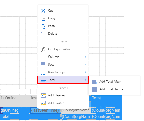
- Add Total After: Displays totals or subtotals at the end of group instances.
- Add Total Before: Displays totals or subtotals at the beginning of group instances.
Using the Group Editor
The Group Editor in the report toolbox shows the row and column hierarchies for the currently selected tablix data region. It also provides you options to display totals and subtotals to the chosen group in the editor. If you right-click a cell associated with a parent group, it will display totals. Similarly, if you right-click a cell associated with a child group, it will display subtotals. By default, totals and subtotals use the SUM function.
To show totals or subtotals in a tablix data region, click the vertical ellipses icon next to the row or column group, and choose from the following options.
- Add Total After: Displays totals or subtotals at the end of group instances.
- Add Total Before: Displays totals or subtotals at the beginning of group instances.
Merging cells
Cell merging combines one or more cells to create a new larger cell. You can merge cells to avoid redundancy, improve appearance, or add labels that span several columns or rows.
You can merge the cells in the corner and body area of the tablix. The cells in the corner area can be merged both horizontally and vertically, while the cells in the body area can be merged only in the horizontal direction. Cells with duplicate values in the row group and column group areas are automatically merged into a single cell while previewing the report.
NOTE When you merge multiple cells, only the content of the upper-left cell for left-to-right languages, or the upper-right cell for right-to-left languages is preserved.
Merging cells in a tablix data region
- Select the cells in the corner area of the tablix. Use the Ctrl key to select more than one cell.
- Right-click the selected cells, and choose the Cells > Merge Cells option from the context menu.
Splitting cells in a tablix data region
- Select the cell you want to split.
- Right-click the selected cell, and choose the Cells > Split Cells option from the context menu.
NOTE You cannot split an unmerged cell.
Freezing rows and columns
In an RDL report, when a user previews a tablix data region containing a large amount of data in Galley mode, they must scroll to see all of the data. However, on scrolling the row or column headers out of sight, the data becomes difficult to understand.
To overcome this problem, you can freeze the row(s) and column(s) so that they remain visible while the rest of the tablix scrolls. You can freeze as many header rows or columns as you have in the data region.
Steps
- Select the entire tablix and go to the Properties pane on the right.
- Scroll down the panel and find the Frozen Rows and Frozen Columns properties.
- Use the Frozen Rows property to specify the numbers of row(s) you want to freeze in the tablix.
- Use the Frozen Columns property to specify the number of column(s) you want to freeze in the tablix.
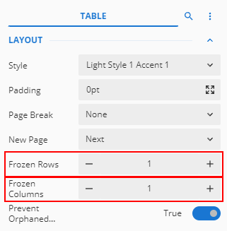
NOTE The Frozen Rows and Frozen Columns properties are only applicable to the header row(s) and column(s) of the tablix data region, which means the number of row(s) and column(s) you want to freeze should not exceed the actual number of header row(s) and column(s) in the tablix.
Expanding and collapsing groups
In a tablix data region, you can show or hide the rows and columns associated with groups using the expand and collapse toggle icons. This is extremely beneficial when you are working with a large amount of data. For example, in the below tablix, you can collapse the Product Line group to hide the details about each product's costing and quantities over the year.
The easiest way to enable users to expand and collapse groups in a tablix data region is through the Expand/Collapse Groups option in the Tablix Wizard. Refer to Tablix Wizard.
This can also be achieved by setting the visibility properties for the group item. You need to specify the text box name where you want to display the expand and collapse toggle icons in the data region, represented by plus (+) and minus (-) signs at the time of preview. For more details, refer to the below section.
The ability to expand and collapse groups in a tablix data region allow users to drill down into the data they want to focus on.
Steps
- Click anywhere inside the tablix data region.
- From the Group Editor on the left, select the appropriate group for which you want to hide or show the associated rows or columns. Once the group is selected, you will see the Tablix Member properties in the Properties pane.
- The Hidden property sets the visibility for the selected group item each time you run a report.
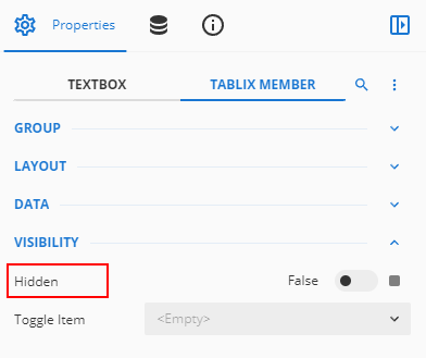
- Set the property to True to hide the group item.
- Set the property to False to display the group item.
- In the Toggle Item property, choose the text box from the drop-down where you want to show the toggle icons.
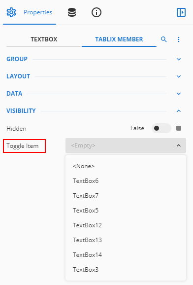
- Then, select the text box associated with the parent group.
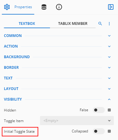
- To specify the initial state of the toggle icons to be displayed on previewing the report, set the Initial Toggle State property to either Collapsed or Expanded in the TextBox properties.
- If you set this property to Collapsed, plus (+) sign is displayed in the initial state.
- If you set this property to Expanded, minus (-) sign is displayed in the initial state.