TextBox report element
NAVIGATION
Modules > Advanced Reporting > Create icon  > Create Report > select report type > Create > TextBox
NAVIGATION
Modules > Advanced Reporting > Categories icon  > click a row > Edit > TextBox
PERMISSIONS Advanced Reporting > View Reporting and run reports
The TextBox element is an input box that can be used to write any text in a report or display any textual data. For example, you can use a text box to write the title of the report or tie it to data from a dataset.
 Adding a TextBox in the report designer
- From the report toolbox on the left, drag and drop the TextBox
 element into the design area.
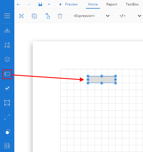
- Now, add the content. You can either type the text directly into the text box or you can bind the text box to a dataset.
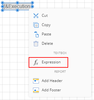
- You can also tie the text box content to expressions. To do this, right-click the text box and select the Expression option.
Binding data to a TextBox
Text boxes, while you can statically define their values, can also dynamically change when you bind data from datasets. This allows you to generate reports quickly without having to manually update fields when data such as device counts or the customer name change.
As follows are the methods you can use to bind data to text boxes:
Method 1 - Context menu
- From the report toolbox on the left, drag and drop the TextBox element into the design area.
- Right-click the text box and select Expression from the drop-down. From there, you can pick from common values that are always present, and any values from the dataset bound to the report, if there is one.
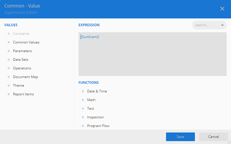
If there are one or more datasets bound to the report, when hovering over the field, an icon will appear. When clicked, you will see all values from the bound datasets that can be bound to that text box.
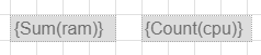
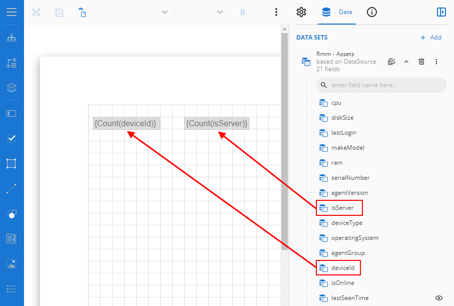
If a numeric field is selected, then by default, the Sum of the numeric field is taken. If the field selected is non-numeric, then the count of the field is taken. In the image below, we have two text boxes. One has a numeric field and another has a non-numeric field.
Method 2 - Data tab: Single data point
- From the report toolbox on the left, drag and drop the TextBox element into the design area.
- From the Data Binding tab on the right, expand the dataset, then drag and drop the desired value into the text box. You can also drag and drop a value from a dataset directly onto the report designer, and it will automatically create a text box with the value in the report. In this example, the report uses the isServer and deviceID fields
Method 3 - Data tab: Create a table
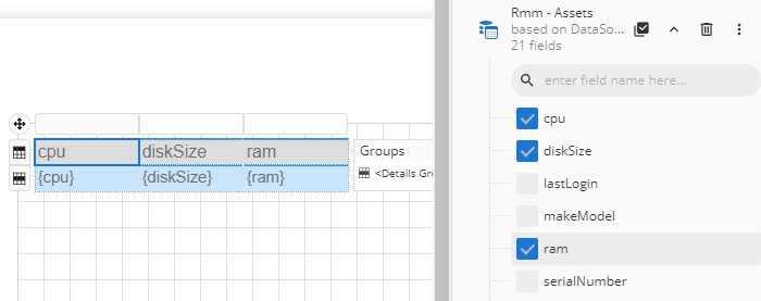
- From the Data pane on the right, click the Select Fields button
 next to the bound dataset and select the desired fields using the check box to the left of each field.
 - Drag and drop the selected fields onto the design area. A table with its column bound to the fields is created and the cells in the table have a text box. For more information on tables, refer to Table report element.
TextBox properties
You can customize the appearance of a text box in the Properties pane. Properties like adding a border, font size, font type, background color, and so forth can be customized.
NOTE *Properties only visible in Show Advanced Properties mode are marked with a red asterisk.
| Property | Description |
|---|---|
| Common |
|
| *Action |
|
| Background |
|
| Border |
|
| Text | This is where you can format the text with the following options:
|
| Dimensions | This sets the location and size of the text box.
|
| Layout |
|
| *Visibility |
|
| *Data |
|
| *User Sort |
|
| *International |
|
| *Misc |
|


