Image report element
NAVIGATION
Modules > Advanced Reporting > Create icon  > Create Report > select report type > Create > Image
NAVIGATION
Modules > Advanced Reporting > Categories icon  > click a row > Edit > Image
PERMISSIONS Advanced Reporting > View Reporting and run reports
The Image element is used to display images you want to add to a report. You can use images in various scenarios, like displaying logo images or a picture of a type of device for easy visual identification.
You can use this element directly in a report or within a table cell.
The supported image formats are as follows:
- BMP
- JPEG
- GIF
- PNG
- EMF
- WMF
- SVG
 Adding an image in the report designer
- From the report toolbox on the left, drag and drop the Image
 element into the design area. You can also add it to a table cell.
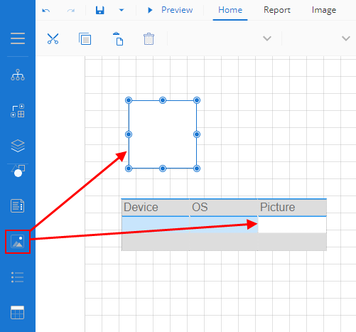
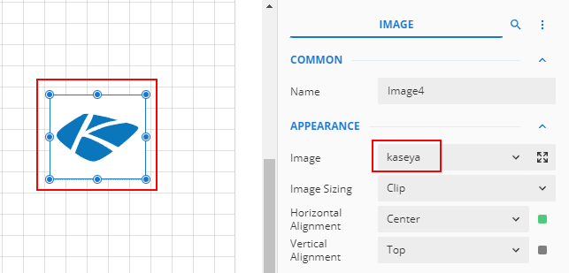
- Now, you need to set the source of the image. In the Appearance section of the Properties pane, click the drop-down list for image.
You will see the following three options: Shared, Embedded, and Database.
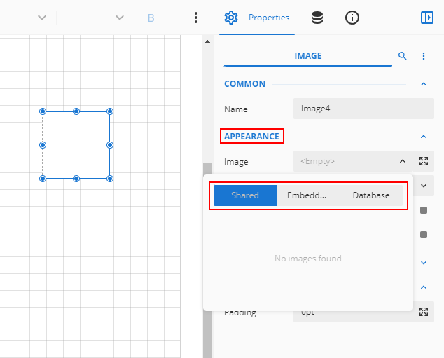
NOTE Only embedded images are supported at this time.
Embedded images are stored locally on your device that can then be embedded into the report. These are uploaded image files that are used only by the current report.
- In the Appearance section of the Properties pane, select Embedded in the Image drop-down menu, and click Load.
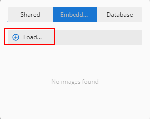
- In the window that opens, navigate to the image you wish to upload, select the image, and click Open.
The selected image will then be displayed under the Embedded option.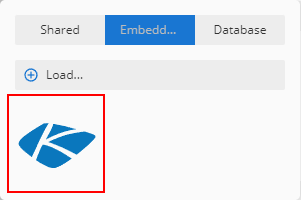
- Select the image from the list, and the selected image will be displayed in the Image element on the report. For additional configuration, refer to Image properties.
NOTE Images can also be embedded in Shapes.
Image properties
You can customize the appearance of an image in the Properties pane.
NOTE *Properties only visible in Show Advanced Properties mode are marked with a red asterisk.
| Property | Description |
|---|---|
| Common |
|
| *Action |
|
| Appearance |
NOTE Only Embedded images are supported at this time. |
| Border |
|
| Dimensions | This sets the location and size of the text box.
|
| Layout |
|
| *Visibility |
|
| *Misc |
|


