Shape report element
NAVIGATION
Modules > Advanced Reporting > Create icon  > Create Report > select report type > Create > Shape
NAVIGATION
Modules > Advanced Reporting > Categories icon  > click a row > Edit > Shape
PERMISSIONS Advanced Reporting > View Reporting and run reports
The shape element is a visual element used to highlight a specific area of a report.
You can choose between a rectangle, rounded rectangle, and ellipses.
 Adding a shape in the report designer
- From the report toolbox on the left, drag and drop the Shape
 element into the design area.
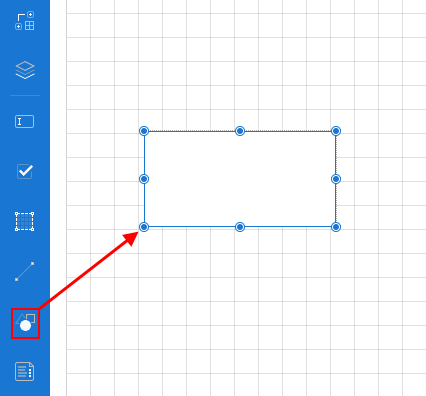
- Using the Properties pane, customize the appearance of the shape element. For more information, refer to Shape properties.
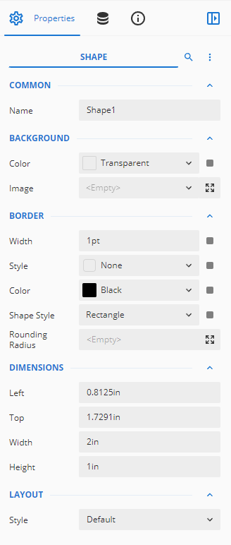
Shape properties
You can customize the appearance of a shape in the Properties pane.
NOTE *Properties only visible in Show Advanced Properties mode are marked with a red asterisk.
| Property | Description |
|---|---|
| Common |
|
| Background |
|
| Border |
|
| Dimensions | Set the position and size of the shape.
|
| Layout |
|
| *Visibility |
|
| *Data |
|
| *Misc |
|


