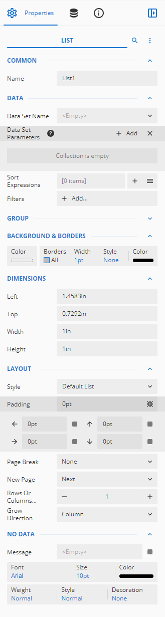
| Common |
- Name: Sets the name of the selected text box.
|
| Data |
- Data Set Name: Select a dataset from the drop-down. Use this drop-down when you have more than one dataset bound to the report.
- Data Set Parameters: Use the + Add button to add parameters to the dataset. You can enter static values, expressions, or data fields as parameters. Refer to Advanced Reporting: Expression Editor.
- *Element Name: Enter a name to be used in the XML output for this report control.
- *Element Output: Choose Auto, Output, NoOutput, or ContentsOnly to decide whether to include this control in the XML output. Choosing Auto exports the contents of the report control.
- *Data Instance Name: Select a dataset instance from the drop-down. Use this drop-down if you have more than one dataset instance associated with the dataset.
- *Data Instance Element Output: Choose Output or NoOutput to decide whether to include this control in the XML output.
- Sort Expressions: Set a sort expression for the list element using this property.
- Filters: Add filters to filter out the data from the report.
|
| Group |
- Name: Add a unique name to the group. Special characters such as period (.), space ( ), forward slash (/), backslash (\), exclamation marks (!), and hyphens (-) are not supported. You can use an underscore (_) in the name of the container.
- Group Expressions: Enter an expression to use for grouping the data. Click the + Add button to add the group expressions.
- Page Break: Select a page break option (None, Start, End, StartAndEnd, or Between) using the drop-down.
- *Parent: Select the parent group you wish this group to be under.
- *Label: Define the group label for the purposes of Table of Contents visibility.
- *Data Element Name: You can enter a name to be used in the XML output for this group.
- *Data Collection Name: Define the collection name if needed.
- *Data Element Output: You can select Auto, Output, or NoOutput to decide whether to include this checkbox in the XML output or not. Auto exports the contents of the group only when the value is not a constant.
- *New Section: Choose whether this group appears in a new section of the report.
- Filters: Add filters to filter out the grouped data from the report. See the Filter Data help article for more information.
|
| Background |
- Color: This option sets the background color of the shape. You can select the color by clicking Color button to open the color drop-down.
- Image: Choose an image to embed as the background of the shape.
|
| Border |
- Width: You can set the width of the image border using this option.
By default, the width is 1pt.
- Style: Select the border style from the drop-down list. By default, the border style is none.
- Color: Select the border color from the drop-down list. By default, the color is black.
|
| Dimensions |
This sets the location and size of the text box.
- Left: This option sets the distance to be maintained from the upper left side of the list horizontally.
- Top: This option sets the distance to be maintained from the top of the list vertically.
- Width: This option sets the width of the list.
- Height: This option sets the height of the list.
|
| Layout |
This sets the layout of the text box. - Style: This option sets the theme of the text box. Styles will typically change items such as the font, font size, background color, and/or text color of the text box.
- Padding: Padding refers to the space between the text box content and the border. You can set the padding for all sides, or click the expansion icon to set padding for each side individually.
- *Layer Name: Sets the report layer.
- Page Break: Set a page break between the List control and other report elements using the drop-down. The following options are available in the drop-down,
- None: No page break between the list control and other elements.
- Start: Page break at the start of the list control.
- End: Page break from the end of the list control.
- StartAndEnd: Page break at both the start and end of the list.
- New Page: Select an option from to start the content after a page break. The available options are Next, Odd, and Even.
- *New Section: Choose whether this list appears in a new section of the report.
- *Keep Together: This option ensures that the list will appear on the same page or not when there is a lot of content.
- *Consume White Space: To remove all extra space, set this property to True. By default, the value is set as False.
- Rows or Columns Count: Enter a value to add the number of rows or columns to List control.
- Grow Direction: Select a growing direction of the list from the following options: Column, ColumnReverse, Row, or RowReverse.
- *Z-Index: This property sets the position of the table of contents. Controls with a greater Z-Index value will always be in front of the control that has a lower Z-Index value.
|
| No Data |
In No Data, you will set the message that displays when a list entry contains no data, as well as it's formatting. - Message: Enter a message to display for no data content.
- Font, Size, and Color: Set the font family, size, and color of the font for the No Data content.
- Weight, Style, and Decoration: Set the appearance of the No Data content using the Weight, Style, and Decoration properties.
- *Text Align: Set the horizontal alignment of the text.
- *Vertical Align: Set the vertical alignment of the text.
- *Format: Select the format you want to apply to the text in the text box (for example, currency).
|
| *Visibility |
- Hidden: This option sets whether to hide the image or not on the preview.
- Toggle Item: Visibility can be toggled by another report item. This option sets another item, such as another text box, as a toggle button to display the current text box or not.
|
| *International |
- Calendar: Select which calendar to use when expressing dates. This is set to Gregorian by default.
- Direction: Set the direction that text reads in the text box. This is set to Ltr (left to right) by default.
- Language: Select the language of the text box.
- Numeral Language: Select the numeral language of the text box.
- Numeral Variant: Select the numeral variant of the text box.
- Unicode BiDi: Select from Normal, Embed, and BidiOverride.
- Upright in Vertical Text: Select which kind of character alignment happens when writing in a vertical mode.
- Writing Mode: Select the writing mode, between lr-tb (left to right, top to bottom) and tb-rl (top to bottom, left to right).
|
| *Misc |
- Tooltip: Sets the textual label of the report control when the mouse is moved over the cell.
- Label: Sets a textual content that is used as the display text for report catalog items. The report catalog is made using the Table of Contents element in the toolbox, and the table of contents is used for quick positioning jumps in multi-page reports.
- Bookmark: Enter text or an expression to use as a positioning identifier to jump to this element. You can define the bookmark and then select the Jump to bookmark setting, to make it easier to jump between report content. You can bookmark any element in the report to make it a destination anchor for the jump.
|
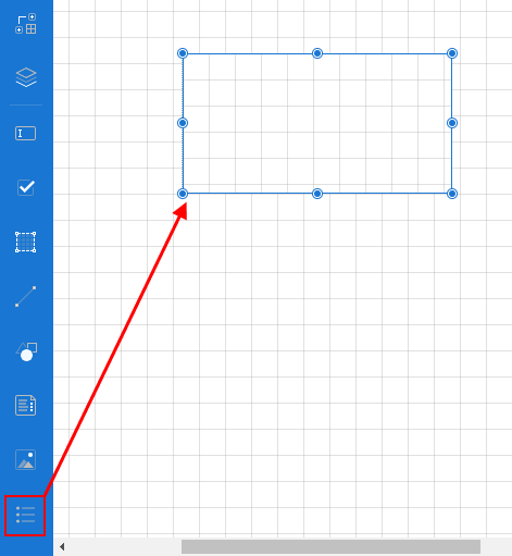
 > Create Report > select report type > Create > List
 > click a row > Edit > List
 Adding a list in the report designer
 element into the design area.