Container report element
NAVIGATION
Modules > Advanced Reporting > Create icon  > Create Report > select report type > Create > Container
NAVIGATION
Modules > Advanced Reporting > Categories icon  > click a row > Edit > Container
PERMISSIONS Advanced Reporting > View Reporting and run reports
The Container element is used as a container for other report elements and highlights the report elements added to the container. No data is associated with the Container element. You can also customize the appearance of the container using visual settings like the border, dimensions, background, and layout.
In essence, you can create a section of the report with multiple report elements and easily move and copy that container and its contents.
 Adding a container in the report designer
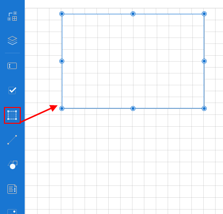
- From the report toolbox on the left, drag and drop the Container element into the design area.
- Using the Properties pane, customize the appearance of the container. Refer to Container properties.
- To add other elements to the container, drag and drop the element from the report toolbox into the design area of the container.
EXAMPLE As follows is an example of a container element with check boxes, text boxes, and a line control:
Container properties
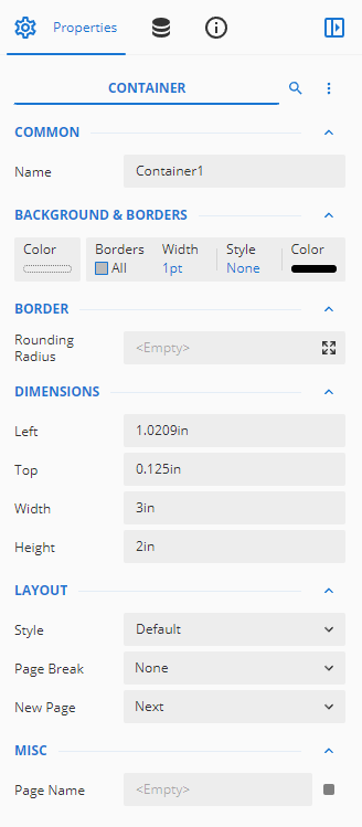
You can customize the appearance of a Container in the Properties pane of the element.
NOTE *Properties only visible in Show Advanced Properties mode are marked with a red asterisk.
| Common |
- Name: Add a unique name to the container. Special characters such as period (.), space ( ), forward slash (/), backslash (\), exclamation marks (!), and hyphens (-) are not supported. You can use an underscore (_) in the name of the container.
|
| Background |
- Color: This option sets the background color of the container. You can select the color by clicking the drop-down list.
- *Image: This option sets the background image of the container. Click the drop-down list to select the image source.
|
| Border |
- Width: You can set the width of the border using this option.
By default, the width is 1pt.
- Style: Select the border style from the drop-down list. By default, the border style is none.
- Color: Select the border color from the drop-down list. By default, the color is black.
- *Rounding Radius: Set the radius of the rounded corners. Acceptable radius values range from 1 to 30 points. To set the rounding radius for specific corners, click the Expand button and set the radius of each corner using the input boxes.
|
| Dimensions |
This sets the location and size of the text box.
- Left: This option sets the distance to be maintained from the upper-left side of the container horizontally.
- Top: This option sets the distance to be maintained from the top of the container vertically.
- Width: This option sets the width of the container.
- Height: This option sets the height of the container.
|
| Layout |
This sets the layout of the container. - Style: This option sets the theme of the container.
- Page Break: This option sets the behavior of the container in RDL Reports. Select the page break behavior from the following options:
- None: Inserts no page break.
- Start: Inserts a page break before the container.
- End: Inserts a page break after the container.
- StartAndEnd: Inserts a page break before and after the container.
- New Page: This option sets the behavior of the container in RDL Reports. Select the new page behavior from the following options:
- Next: The container will show on the next page of the report.
- Odd: The container will show on the next odd page of the report.
- Even: The container will show on the next even page of the report.
- *Keep Together: This option ensures that the container will appear on the same page or not when there is a lot of content.
- *Consume White Space: To remove all extra space, set this property to True. By default, the value is set as False.
- *Z-Index: Z-Index determines the stacking order of the control in the z-axis.
|
| *Visibility |
- Hidden: This option sets whether to hide the container or not on the preview.
-
Toggle Item: Visibility can be toggled by another report item. This option sets another item, such as another text box, as a toggle button to display the current text box or not.
-
Initial Toggle State: This option sets the display state of the container (that can be used as a toggle button) when the report is first loaded. If it is Collapsed, then the toggle element shows as a plus sign, and all the content of the current text box is hidden. If it is Expanded, then the toggle element shows as a minus sign, and all the content of the current text box is displayed.
|
| *Data |
- Element Name: You can enter a name to be used in the XML output for this container.
-
Element Output: You can select Auto, Output, or NoOutput to decide whether to include this container in the XML output. Auto exports the contents of the container only when the value is not a constant.
- Element Style: You can select Auto, AttributeNormal, or ElementNormal to decide whether to render containers as Attributes or Elements in the exported XML file. Auto uses the report's setting for this property.
|
| Misc |
- Page Name: This options adds a name to the container to use when exporting the report.
- *Tooltip: Sets the textual label of the container when the mouse is moved over the cell.
- *Label: Sets a textual content that is used as the display text for report catalog items. The report catalog is made using the Table of Contents element in the toolbox, and the table of contents is used for quick positioning jumps in multi-page reports.
- *Bookmark: Enter text or an expression to use as a positioning identifier to jump to this element. You can define the bookmark and then select the Jump to bookmark setting, to make it easier to jump between report content. You can bookmark any element in the report to make it a destination anchor for the jump..
- *Heading Level: Sets the heading levels in the TOC
|
 element into the design area.