CheckBox report element
NAVIGATION
Modules > Advanced Reporting > Create icon  > Create Report > select report type > Create > CheckBox
NAVIGATION
Modules > Advanced Reporting > Categories icon  > click a row > Edit > CheckBox
PERMISSIONS Advanced Reporting > View Reporting and run reports
The CheckBox element is used to represent a Boolean (selected/cleared) value in a report. This report element has two parts: the interactive check box icon and the label.

 Adding a CheckBox in the report designer
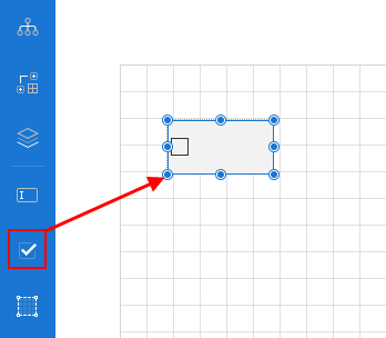
- From the report toolbox on the left, drag and drop the CheckBox element into the design area.
- To add text, double-click the element. Alternatively, you can enter text in the Text field within the Common section of the Properties pane. You can also bind the check box label to a dataset value.
- You can format text in the CheckBox element using the toolbar or via the Properties pane. Refer to CheckBox properties.
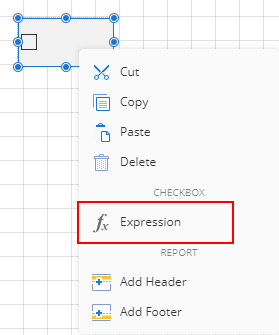
- To add an expression to a check box, right-click the check box and select Expression.
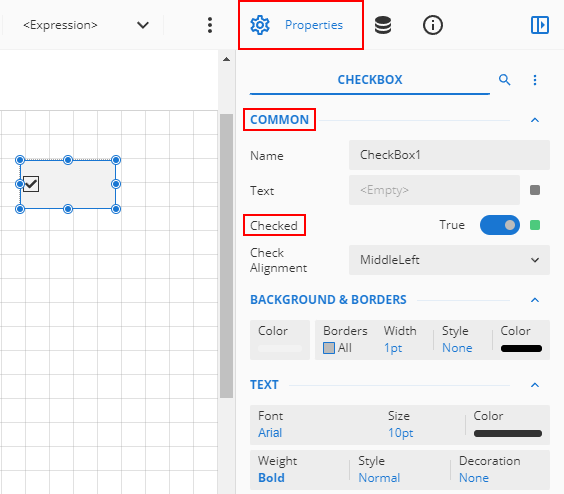
- The check box is cleared by default, but you can select it either by clicking directly on the check box icon or within the Common section of the Properties pane using the Checked option.
CheckBox properties
You can customize the appearance of a check box in the Properties pane. Properties like adding a border, font size, font type, background color, and so forth can be customized.
NOTE *Properties only visible in Show Advanced Properties mode are marked with a red asterisk.
| Common
|
- Name: Sets the name of the selected check box.
- Text: Sets the data to be displayed in the check box. You can enter text directly, or click the small box to the right of the field to add an expression or dataset value.
- Checked: Sets whether the check box is checked or not. Set it to True for checked, and False for unchecked.
- Check Alignment: Sets the alignment of the check box text and icon within the control area.
|
| Background |
- Color: This option sets the background color of the check box. You can select the color by clicking the drop-down list.
- *Image: This option sets the background image of the check box. Click the drop-down list to select the image source.
|
| Text |
This is where you can format the text with the following options: - Font: Select the font of the text in the check box.
- Size: Select the text size of the text in the check box.
- Color: Select the color of the text in the check box.
- Weight: Select the weight (for example, bold) of the text in the check box.
- Style: Select if you want the text in the check box to be normal or italicized.
- Decoration: Select the decoration (e.g. underline, strikethrough) you want to apply to the text in the check box.
- *Wrap Mode: Choose how text wraps in the check box. You can pick between NoWrap, CharWrap, and WordWrap.
|
| Border |
- Width: You can set the width of the border using this option.
By default, the width is 1pt.
- Style: Select the border style from the drop-down list. By default, the border style is none.
- Color: Select the border color from the drop-down list. By default, the color is black.
|
| Dimensions |
This sets the location and size of the check box.
- Left: This option sets the distance to be maintained from the upper left side of the check box horizontally.
- Top: This option sets the distance to be maintained from the top of the check box vertically.
- Width: This option sets the width of the check box.
- Height: This option sets the height of the check box.
|
| Layout |
This sets the layout of the text box. - Style: This option sets the theme of the check box. Styles will typically change items such as the font, font size, background color, and/or text color of the check box.
- Padding: Padding refers to the space between the check box content and the border. You can set the padding for all sides, or click the expansion icon to set padding for each side individually.
- *Layer Name: Sets the report layer.
- *Z-Index: This property sets the position of the check box when multiple check boxes are stacked together. The check box with a greater Z-Index value will always be in front of the check box that has a lower Z-Index value.
|
| *Visibility |
- Hidden: This option sets whether to hide the check box or not on the preview.
-
Toggle Item: Visibility can be toggled by another report item. This option sets another item, such as another check box, as a toggle button to display the current check box or not.
|
| *Data |
- Element Name: You can enter a name to be used in the XML output for this text box.
-
Element Output: You can select Auto, Output, or NoOutput to decide whether to include this check box in the XML output. Auto exports the contents of the check box only when the value is not a constant.
- Element Style: You can select Auto, AttributeNormal, or ElementNormal to decide whether to render check boxes as Attributes or Elements in the exported XML file. Auto uses the report's setting for this property.
|
| *Misc
|
- Tooltip: Sets the textual label of the check box when the mouse is moved over the cell.
-
Label: Sets a textual content that is used as the display text for report catalog items. The report catalog is made using the Table of Contents element in the toolbox, and the table of contents is used for quick positioning jumps in multi-page reports.
- Bookmark: Enter text or an expression to use as a positioning identifier to jump to this element. You can define the bookmark and then select the Jump to bookmark setting, to make it easier to jump between report content. You can bookmark any element in the report to make it a destination anchor for the jump.
- Heading Level: Sets the heading levels in the TOC.
|
 element into the design area.